Which U.S. asset class is more likely in a bubble right now — stocks or housing? More than 80% of traders polled in a Charles Schwab survey say both.
To shed light on this question, let’s look at where both asset classes stand relative to their long-term trendlines. It’s important to take a long-term perspective because commentators seem overly eager to detect bubbles everywhere they look these days. They (and we) need to be reminded that not every bull market is a bubble, and not every bear market represents the bursting of a bubble.
Why are we so eager to detect bubbles? Will Goetzmann, a finance professor at Yale University, told me that he suspects it traces to the moral overtone that investors have when they declare something to be forming a bubble. When they do, he said, they’re implying that those who lose big in that bear market will be getting what they deserve.
This column leaves moral judgments out of the equation. I instead am focusing on the most comprehensive data set of U.S. equity and housing returns that I know. This database, which extends back to the late 1800s, was compiled by Òscar Jordà of the Federal Reserve Bank of San Francisco, Katharina Knoll of Deutsche Bundesbank in Frankfurt, Dmitry Kuvshinov and Moritz Schularick, both of the University of Bonn, and Alan M. Taylor of the University of California Davis.
This database is unique in several ways. One big advantage is that it includes data for both stocks and housing; other databases extend further back in the case of the stock market but don’t include housing. The database also takes rent into account when calculating housing’s return. Some prior historical analyses of housing’s return have focused only on price appreciation, which significantly underreports housing’s performance.
The chart below plots the returns since 1890 of U.S. stocks and housing. Notice that equities and housing have each produced largely similar returns over the past 130 years. As recently as the late 1940s, housing was ahead of equities for cumulative performance since 1890. As recently as the late 1970s the two data series were nearly neck-and-neck. Notice further that housing’s performance has been less volatile than the stock market’s, especially since World War II.
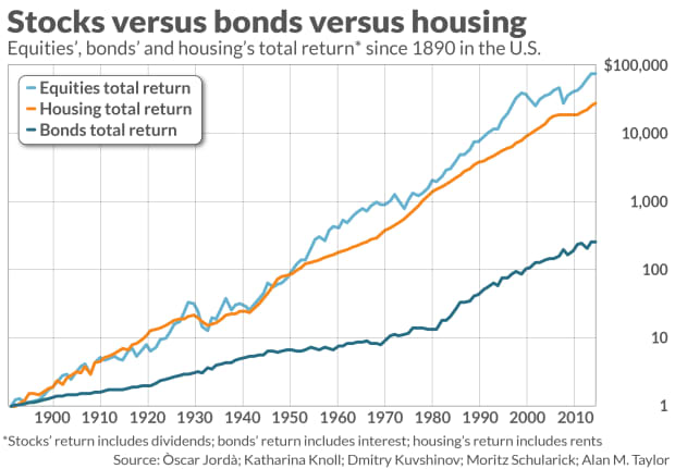
For each asset class I calculated an exponential trendline that most closely fit the 130 years’ worth of data. The bad news is that both stocks and housing currently are above their respective trendlines, so if you insist that both assets are in bubbles now you in fact could find some statistical support.
Of the two, the stock market is further ahead of its long-term trendline than is housing. So if you’d have to pick which of the two is more likely to decline significantly, you should choose stocks.
Bonds are vulnerable
I’ve not said anything about bonds, but they are even further ahead of their trendline than either stocks or housing. So from this long-term perspective they are even more vulnerable than stocks to a big decline.
Though the chart does not include these three asset classes’ trendlines, beginning in 1980s all three rose above their trendlines and have stayed there ever since. A common explanatory factor is at work here: lower U.S. interest rates. This is most easily understood in the context of bonds, since bond prices rise when interest rates fall. But stocks and housing also tend to become more valuable when interest rates decline.
This crucial role played by falling interest rates helps us appreciate why all three assets likely will eventually return to their trendlines. Interest rates can’t keep going down forever, after all. Yet we implicitly assume they will when we extrapolate these asset classes’ return over the past four decades.
Even if U.S. interest rates stay constant over the next couple of decades — a big if — then the distance that all three asset classes are from their trendlines will narrow. And it’s entirely possible that, if rates rise significantly, all three will drop below their trendlines at some point in the next decade or two — something last experienced in the 1980s.
Most investors today weren’t paying attention to the markets back then, if they were even born. That’s why this walk down memory lane is so important. Without a sense of history we can all too easily make the mistake of thinking the recent past is how markets always behave. It isn’t. Let’s hope that we don’t have to endure the popping of a bubble to learn that lesson.
Mark Hulbert is a regular contributor to MarketWatch. His Hulbert Ratings tracks investment newsletters that pay a flat fee to be audited. He can be reached at [email protected]
Plus: We’re looking at stocks as money pots, and that’s just not in the cards


